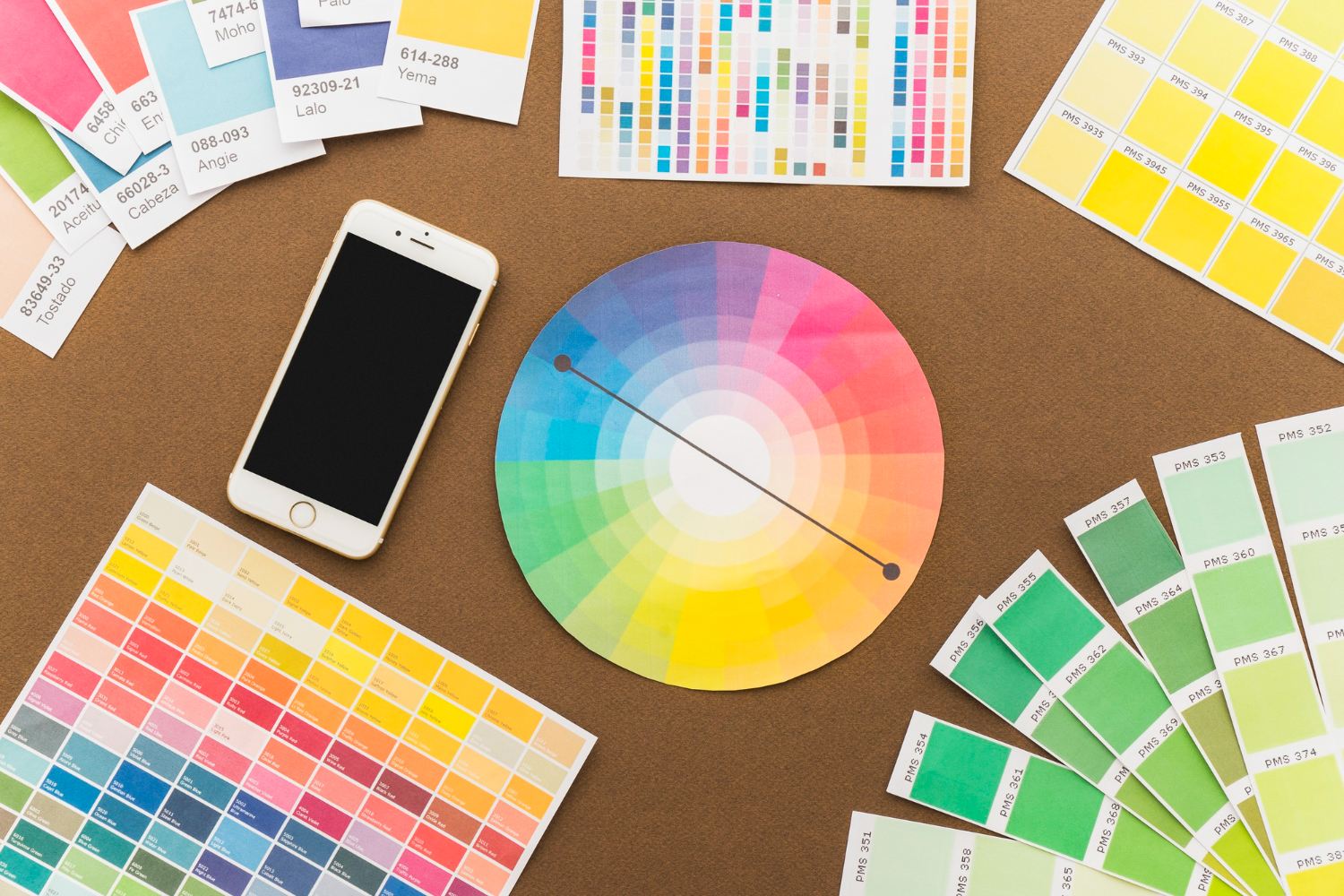
Does this sound familiar? You’ve produced your stunning new leaflet. You’ve matched the background colour against brand guidelines. And then press print. The advances in print technology mean that beautiful colour printing is better than ever before. However, the issue of print colours not matching their vibrant digital counterparts still remains a common headache. Let’s take a look at the difference between RGB vs CMYK.
The Colour Conundrum
We all love colour. Colour plays a pivotal role in conveying the energy of brands we work with. However, the medium of communication matters significantly. Does a company predominantly engage with its audience digitally, through websites and social media, or through printed materials like brochures and leaflets?
If digital rules, RGB offers an extensive palette of vibrant colours. The downside? When printed, these hues often lose their lustre in CMYK. But what’s the story behind RGB and CMYK, and why are they at odds?
RGB vs CMYK
RGB (Additive Colour)
RGB stands for Red, Green, and Blue, the colour system adorning computer screens, TVs, and mobile devices. It’s an additive method, where varying combinations of these colours create the full spectrum of hues, including a whopping 9,777,216 more.
How it works:
- Start with black, then add colours to increase brightness.
- Red and Green create Yellow.
- Blue and Red combine to form Magenta.
- Green and Blue produce Cyan.
- All three together yield White.
CMYK (Subtractive Colour)
CMYK, short for Cyan, Magenta, Yellow, and Key (Black), reigns supreme in the printing world. Here, these four colours blend in different proportions to craft printed imagery. CMYK adopts a subtractive approach, where mixing colours darkens rather than brightens. The colour gamut here is significantly smaller, nearly half that of RGB.
How it works
Unlike RGB, CMYK starts with white and darkens with added colours.
- Cyan and Magenta combine to form Blue.
- Cyan and Yellow mix to create Green.
- Yellow and Magenta yield Red.
- When all three unite, you get something closer to muddy brown, where the Key (Black) colour steps in to deepen the shadows.
RGB vs CMYK: The Culprit
These disparities between RGB and CMYK are the root cause of your colour woes. RGB’s additive magic produces shades and brilliance that CMYK simply cannot replicate. So, if you’ve picked a colour that’s outside CMYK’s reach, it’ll emerge on print far duller than your screen envisioned.
The Pantone Solution
There is a remedy, albeit potentially costly: Pantone colours. These specially formulated inks, also known as spot colours, offer unique and vibrant shades, even fluorescent and metallic. But here’s the catch: Pantone colours require lithographic printing, an expensive process suitable for large print runs but not cost-effective for small batches.
Choosing RGB vs CMYK Wisely
Selecting the right colours hinges on the context. For digitally-focused companies, RGB’s wide spectrum is ideal. Meanwhile, those heavily reliant on printed materials should embrace CMYK to ensure their colours shine as intended.
Define Your RGB vs CMYK Palettes
But what if you need both digital and print perfection? Here’s where you can have it all. Why not offer colour palettes for both print and digital? This way, your artwork and brand shine, no matter the platform.
If you require colours for both digital and printed communications, you can define palettes to suit each medium. RGB dazzles on screens, while CMYK holds its own in print. It’s about using the right tool—or colour mode—for the job at hand.Understanding why colours behave differently on screen and in print can help you navigate this intricate terrain and, hopefully, reduce colour-related headaches.
